Package Design
Small Rituals

Package Design
Small Rituals
Package Design
Small Rituals
Project Details
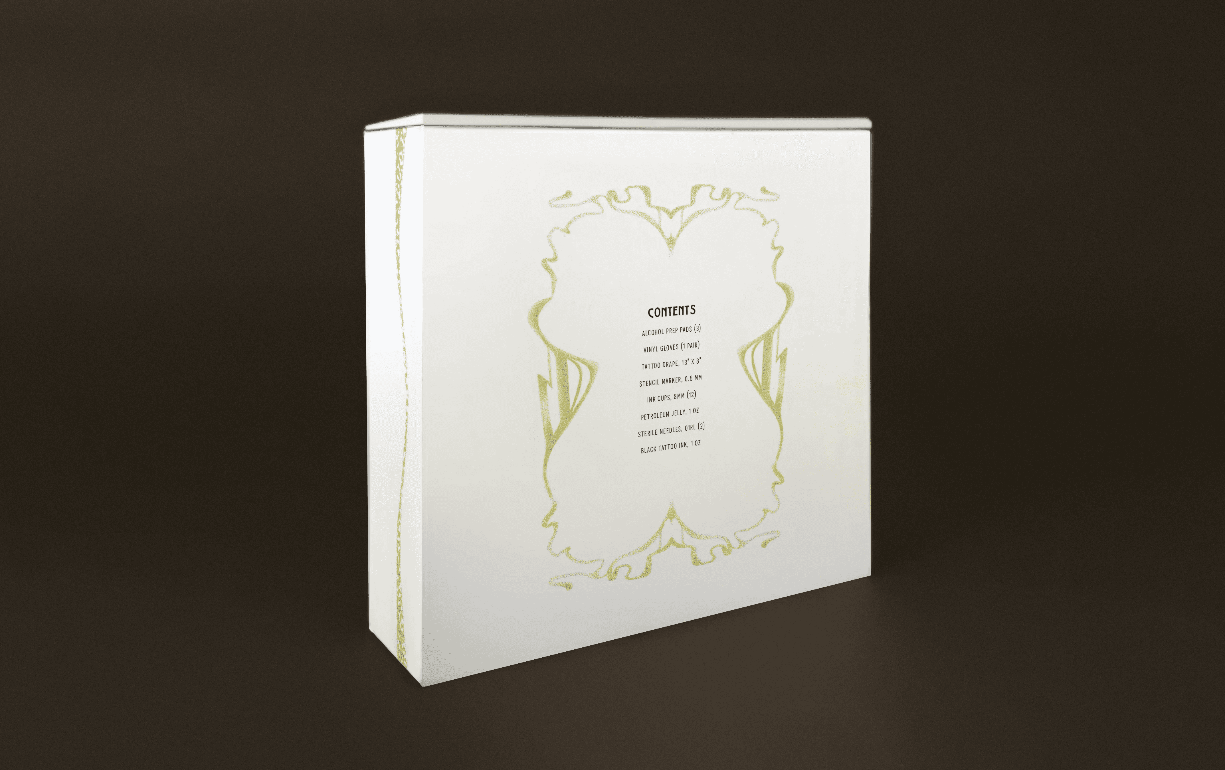
Small Rituals is a hand-poke tattoo kit package design exploration using historical reference and contemporary packaging. Drawing from Vienna Secession and Art Nouveau influences, the kit uses ornamental typography, detailing that is reminiscent of hand-poke tattoo texture and form, and a floral color palette to create a design that feels elegant and slightly subversive. The system includes the outer packaging, individual item labels, and instructional materials. Each component was considered as part of a cohesive experience of usability and a collectible aesthetic. A large part of the process involved experimenting with type pairings and hierarchy, especially in finding a body typeface that could support more decorative display elements without losing readability. Iteration focused on creating contrast within the system while still maintaining consistency across formats and scales.
Project Details
Small Rituals is a hand-poke tattoo kit package design exploration using historical reference and contemporary packaging. Drawing from Vienna Secession and Art Nouveau influences, the kit uses ornamental typography, detailing that is reminiscent of hand-poke tattoo texture and form, and a floral color palette to create a design that feels elegant and slightly subversive. The system includes the outer packaging, individual item labels, and instructional materials. Each component was considered as part of a cohesive experience of usability and a collectible aesthetic. A large part of the process involved experimenting with type pairings and hierarchy, especially in finding a body typeface that could support more decorative display elements without losing readability. Iteration focused on creating contrast within the system while still maintaining consistency across formats and scales.


Process
The construction process began by developing a flat template of the box structure, which was cut from rigid cardboard to ensure durability and form. Illustration board was used as a clean outer layer to create a smooth surface for applying graphics. All visual elements were printed on adhesive paper and applied as both surface graphics for the box and wraps for the individual components.